top of page

My Role: UX, UI, Branding
RQM Design Portfolio Website
User Experience
CASE STUDY
Overview
RQMDESIGN.COM is my portfolio website offering recruiters and hiring managers a quick and easy way to access past work in order to determine the next steps in the hiring process.
Challenges
Portfolio website that provides content in a confusing manner. Although the homepage provides easy access to content; the link descriptions are general. Once on the selected page, the site provides zero descriptions to the projects displayed. This has led to recruiter and hiring manager confusion over the objective of each project and what the design contributions were.


Goals
-
Provide content that is quickly accessible, with descriptions of projects and contributions.
-
Provide content that also provides more details for any user who wants to take an in-depth look at my previous work experience.
Above the fold: Allow users to assess job qualifications quickly by providing access to content divided into design categories.
Include a featured section showcasing unique projects that the user might not have time to view otherwise.
Below the fold: Divide content into an interactive resume style, which includes current/former employers, previous roles and products worked on.
Add bullet point list of job qualifications, downloadable resume, email and Linkedin profile access.
Target Audience
Similarities:
-
Both have little time to spend on portfolio sites when searching for candidates.
-
Both have more time to spend on portfolio sites if analyzing a candidates skill set.
Recruiters
Hiring Managers
My design decisions were based around empathizing with the users' time and allowing them to have an easy journey through the website in-order to find the content they are looking for.
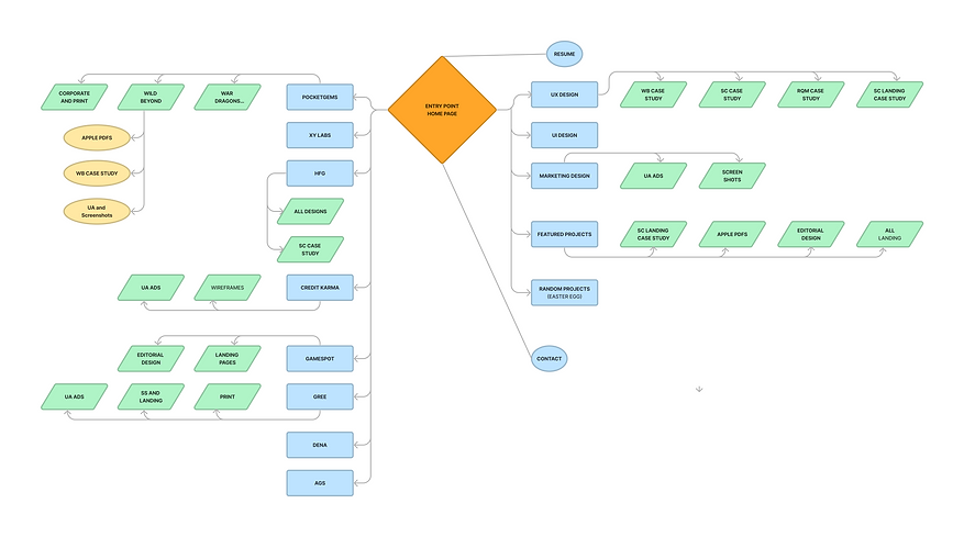
Paper Prototype
Paper Prototype used to organize site content.

Flowchart
Flowchart created from Paper Prototype.
Style Guide
A minimalist aesthetic was designed for the website to allow the content to be the visual focal point of every page.
Color Pallette
#FF8CO2
#000000
#757575
#C7C7C7
#F5F5F5
Fonts
Verdana -heading, paragraph, subtext
Lulo Clean-heading 2
#FFFFFF
*1-2 pixel stroke allowed for lighter images.
(#C7C7C7)
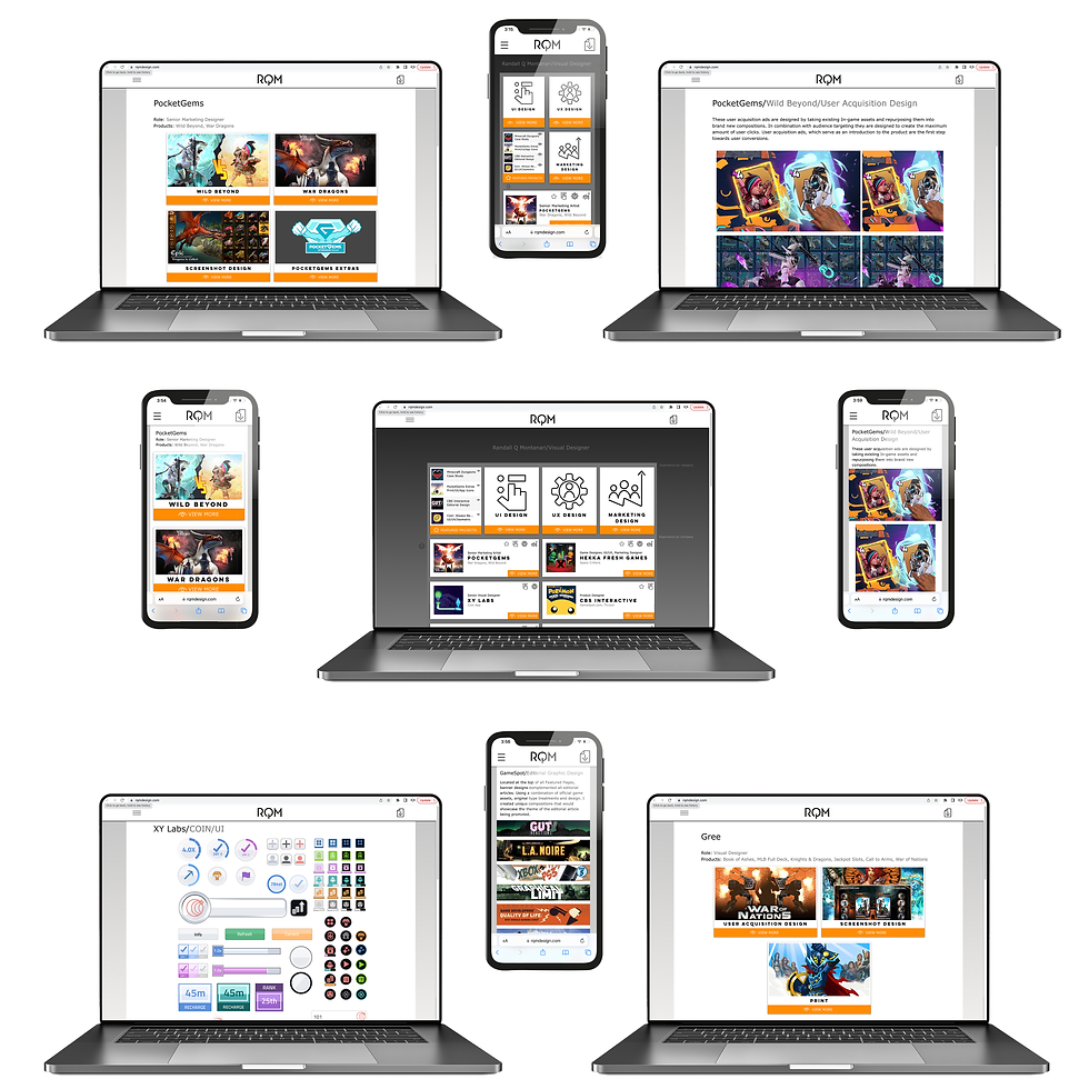
Content Modules
One of the challenges I ran into on this project was how to present my previous work in a quick and digestible way. My design solution was to create specialized modules that included:
-
A colorful thumbnail to draw the eye.
-
Title or/and brief description.
-
Include icons that represent the type of work the user will see when they open the page (UI, UX, Marketing, featured design)-See Main 2.
-
Add Orange bar to place emphasis on "view more" *Orange is the only color used on the site.
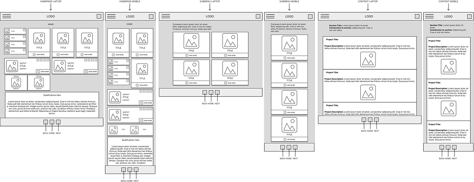
Mid Fidelity Wireframes
Three different wireframes with mobile variations. I created a visual hierarchy that allows easy updates to the page and stackable content that can be added to a page indefinitly simply by attaching another module.
Final UI Design
bottom of page